I want to help you build a sustainable, profitable handmade business that makes you consistent income and sales. I only ever teach or recommend marketing, social media, pricing, production and branding tips that I’ve personally used successfully in my own 7-figure handmade businesses.
I'm Mei, from Los Angeles!
Read More
Popular Posts You'll Love
Looking for something?
Categories
starting a business
get more traffic
running a business
make more sales
branding
growing a business
mindset & productivity
podcasts
pricing & money
product photography
reviews
selling on etsy
selling on amazon
social media
selling wholesale
- Facebook0
- Twitter0
- Pinterest1
- 1share
If you’re just starting to build out your business on Shopify or thinking about it, read this blog post first, where I’ll cover the five most common and expensive Shopify mistakes people make.
So you don’t make the same mistakes.
I’ve been selling on Shopify for many years now, there are no affiliate links in this post, but I just love them so much and wish everyone would use them because they do fantastic for sales.
Shopify is the pioneer for selling products online; no one can compete with them.
If you don’t need any more convincing, then let’s jump into the five mistakes; I’m saving the biggest mistakes for the end of this post, so make sure you read to the end.
First Mistake: Inconsistent Photo Sizes in Your Shop
The first mistake I see many people make is having inconsistent photo sizes in their shop.
The sizes themselves aren’t the most important thing, but you definitely want to make sure your main image ratios are consistent from product to product.
Doing this makes your homepage and collection pages more organized and cohesive, and it just looks way more professional and trustworthy. This means strangers visiting your shop are more likely to buy because people buy from shops they know, like, and trust.
If they don’t feel they trust you, they probably won’t buy, so don’t give people any reason to distrust you!
I like using a square ratio photo size, but you can use whatever works for your product type. A marketplace site like Etsy forces all first or main images for every product listing to be the same image ratio regardless of the shop, and this makes everything line up and is just a better look.
If your other images besides the main image are a different ratio, that’s fine, but I still prefer to keep them all the same to streamline the photo editing process.
Second Mistake: Spending Money on Paid Themes
Mistake number two, please don’t spend any money on a paid theme if you’re just getting started.
You don’t need it!
I almost tripped up over this with my new print-on-demand shop that my husband now runs. When we were just building out that Shopify site, I was so tempted to buy a fancy, highly rated theme that would’ve cost me hundreds of dollars, and I hadn’t even made a single sale back then yet!
Save that money to put towards marketing instead.
No one will see your fancy paid theme on your site if you don’t have a plan for getting traffic.
Shopify has several amazing free themes that can perform just as well.
For the new business I started, we used the Minimal theme, which was totally free, and get this, we’ve made millions of dollars with it. With a free theme.
Once you’ve made some sales and you feel you’re ready to level up, then, by all means, upgrade your site with a paid theme.
You just don’t have to start with one.
Third Mistake: Ruling Out Shopify As Your eCommerce Platform
Mistake number three. So many people have this block, and I know Shopify isn’t the cheapest solution at $29 a month.
But I also don’t want you to compare Shopify with any of its alternatives based on pricing alone because Shopify wins in every other area.
Shopify is faster, more secure, provides better service, is more intuitive to use, has more features, and is ultimately more powerful at making sales for you than any of its competitors.
For just a few dollars more than other options out there.
However, I also want you to think of it in this way. How many products do you have to sell every month to pay that $29 Shopify fee? For me, I just need to sell one necklace!
Use that as motivation to treat your business like a real business and focus on marketing and getting traffic.
Unlike a marketplace site like Etsy, Shopify doesn’t come with a pre-built-in audience. You have to be solely responsible for getting people to your site. As long as you expect that and have a plan for generating traffic, you’ll be fine.
But the mistake I see is people expecting just to set up shop, not lift a finger at getting traffic, and somehow expecting sales to follow.
It doesn’t work like that.
And if you’re wondering then, why not just sell on Etsy?
Well, I have a post comparing Etsy and Shopify and why I believe Shopify to be the superior option that you can read later.
Fourth Mistake: Using Dynamic Checkout Buttons
Next, mistake number four. I see this with virtually every new Shopify store because I review a lot of them from all the emails we get, and some of them are our A Sale A Day students’ websites.
Many newer Shopify themes make it a default setting to use Dynamic Checkout Buttons. In theory, it sounds super cool.
Shopify checks every visitor to see if they’ve got Amazon, Apple Pay, Google Pay, etc. Depending on what that visitor has, Shopify will dynamically show an additional payment method as a button on your product listing pages.
Unfortunately, this button is super attention-grabbing and very distracting, which is usually a good thing, but this isn’t good for several reasons.
One, you actually want people to buy more than just one thing from your shop.
So adding to the cart is actually the action you want visitors to take, not to checkout right away with just one item.
Two, this bypasses Shopify’s built-in checkout pages, which means you cannot do any remarketing on abandoned carts.
This is when someone enters their email address on the checkout page but, for whatever reason, doesn’t follow through on placing their order.
The majority of people shopping on your site will do this.
So it would help if you had a way to reach back out to those folks to remind them to complete their purchase.
You can’t do this if people click on alternate payment options.
Keeping these dynamic checkout buttons on in your product listings is proven to lower conversion rates and sales overall, so make sure you turn those off!
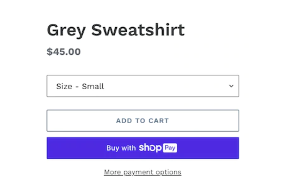
Fifth Mistake: Using Dynamic Checkout Buttons
And the biggest mistake of them all, which can cost you a lot of money, is mistake number five.
I made this mistake myself when I first moved over to Shopify from a self-hosted eCommerce platform called Prestashop, and I lost $2,000 and more.
I talk about that experience in detail in this post, and frankly, no one at the time was talking about this, and I wished they were because it could’ve saved me a lot of money.
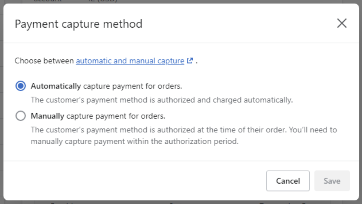
But basically, certain platforms like Shopify have a payment Capture Method feature. When customers enter their credit card information on your site when they’re checking out, two things have to happen.
First, the payment method is authorized, and then second, the charge happens, which is where the payment is processed.
There is actually an option to do only one step automatically with this feature, and that second step is manual.
This is the mistake I made by selecting Manual. If you’ve got this selected, you basically have to manually process the customer’s payment within a specific timeframe, or you don’t get paid.
I recommend just selecting Automatic capture for both steps, so the customer is charged immediately when they checkout, so it’s one less thing for you to worry about.
If you have any Shopify tips of your own that you’d like to share and if you feel this was helpful for you, let me know in the comments.
Thanks for reading! Don’t forget to also check out my YouTube Channel so that you can stay up to date on the latest advice for your handmade business.
Leave a Comment
Liked this article? Share it!
Unlock a Profitable Handmade Business
in Just 12 Weeks Without Using Etsy
or Social Media
FREE WORKSHOP
This workshop is for anyone who makes and sells a handmade or physical product, including jewelry designers, artists, paper designers, bath & body product makers and more!
What You'll Discover
The #1 mistake people make with Etsy & social media that causes shops to FLOP
The secret to making it with your handmade shop so it's no longer just a hobby
How to make sales in your handmade shop with ease so you can finally get to 6-figures
TAKE ME THERE
Your email address will not be published. Required fields are marked *
Leave a Reply Cancel reply
About
Blog
A Sale A Day
Student Login
Free Class
Contact
Terms
Become A Student
Watch On YouTube
Student Reviews
See My Handmade Shop!

Thanks for sharing, I will take note of the things you share, to avoid. Useful post for me!
redactle
What you say makes a lot of sense, and I’ll make a mental effort to steer clear of such pitfalls in the future. What a helpful article!
This is quite helpful, so many thanks for posting it. I hope you’ll be able to provide more of this in the future.
This is a wonderful article full of resources. You described it very well. Thanks for sharing this with us.
This post is amazing we like your post
Thanks for the infiormation..
great article!
Thanks for the information. mybkexperience
thanks for sharing. it is wonderful
Thanks for the information.
I cannot express how grateful I am that you have shared all of this valuable knowledge with me. You have a witty way of writing in your blogs. This is quite helpful and simple to read.
I can’t tell you how grateful I am that you taught me all of this useful information. In your blogs, you write in a clever way. This is very helpful and easy to understand.
Word games are one of the very hot puzzle game genres. It is very popular. Especially young people. Expand vocabulary with simple to complex puzzles. Definitely won’t be bored
I have all made these 5 mistakes
I like what you posted. I’ve read a lot of books that are similar! In contrast to other writings, yours really made an impact on me. It’s great that you write thoughtful posts like this one. Please keep them coming!
it is best information i had read
Great tips for avoiding costly Shopify mistakes! Shopify truly is a game-changer. And if you’re looking for a break from business talk, Retro Bowl is perfect for some classic gaming fun!
This post highlights an essential aspect of e-commerce—consistent photo sizes really do enhance the shopping experience and build trust.
Great insights! It’s crucial to avoid those Shopify pitfalls as you launch your store. Consistent photo sizes and saving on themes are game-changers. Speaking of games, check out Infinite Craft! It’s a fantastic platform that encourages creativity and business skills simultaneously. Just as with Shopify, having a strong foundation is key for success, whether you’re crafting in-game or creating your online business. Keep sharing your tips, they’re invaluable!
Great insights on launching a Shopify store! Avoiding pitfalls like inconsistent photo sizes and costly themes is essential. Speaking of games, don’t forget to try the slope game—it’s a fun way to sharpen skills! Just like in Shopify, a solid foundation leads to success in crafting and business. Keep sharing tips; they’re invaluable for everyone navigating their entrepreneurial journey!
https://slopegame-3d.com/