I want to help you build a sustainable, profitable handmade business that makes you consistent income and sales. I only ever teach or recommend marketing, social media, pricing, production and branding tips that I’ve personally used successfully in my own 7-figure handmade businesses.
I'm Mei, from Los Angeles!
Read More
Popular Posts You'll Love
Looking for something?
Categories
starting a business
get more traffic
running a business
make more sales
branding
growing a business
mindset & productivity
podcasts
pricing & money
product photography
reviews
selling on etsy
selling on amazon
social media
selling wholesale
- Facebook2
- Twitter0
- Pinterest6
- 8shares
Product photos are so important for your shop. In fact, if you have excellent product photos you don’t even need to have your actual product in stock to make a sale.
It is the only and best representation of what you’re selling and the best way to communicate your product to your potential customers.
This isn’t like a brick-and-mortar shop where the customer can touch and feel your products.
Your photos have to do all that work for you. If your photos aren’t good, you’re probably not going to make any sales.
Keep reading because in this post, I’m going to share with you everything you need to know about taking product photos for your handmade shop.
Good Photo vs. Bad Photo
First, let’s talk about what makes a good photo versus a bad photo.
There are just a few technical things to keep in mind when taking a good photo.
Accurate Product Colors
First, the photo needs to accurately capture the colors of your product. With the right lighting (which I’ll talk about more later) this won’t be a problem for you.
It’s all about what type of light bulbs you use.
Avoid Harsh Shadows
Your photos also shouldn’t have any harsh shadows because this can be distracting.
Harsh shadows add a lot of stuff to the picture that doesn’t need to be there and it can be confusing to the customer when they’re looking at your photo.
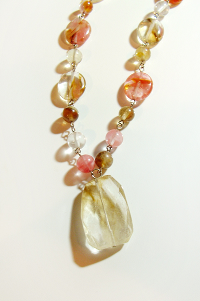
I’ve got an example here of a really old necklace I made many years ago. You can see how the shadows on each stone extend out and it’s tricky to see what’s part of the necklace and what’s actually just a shadow.
It’s not clear what the shape of this centerpiece stone is.
The first thing you can do to avoid harsh shadows is avoid using flash. In general just never use flash.
Secondly, use diffused light. That means there’s a layer of a semi-transparent white material in between your product and the light bulb.
The light bulb should never just be bare, directly shining on the product. This semi-transparent layer helps diffuse the light so it’s not so harsh on the product and as a result, the shadows will appear a lot softer.
That’s why you’ll see when we go shopping for lighting equipment, they almost always have the lights in a box or a white umbrella.

Sharp & Clear
It goes without saying, but your photos need to be sharp and clear. The product needs to be in focus.
If it’s blurry, your customer can’t really see your product well.
It’s all about getting your customer to trust what they’re seeing in your photos. If they’re at any point unsure of what your product looks like, they’re not going to buy.
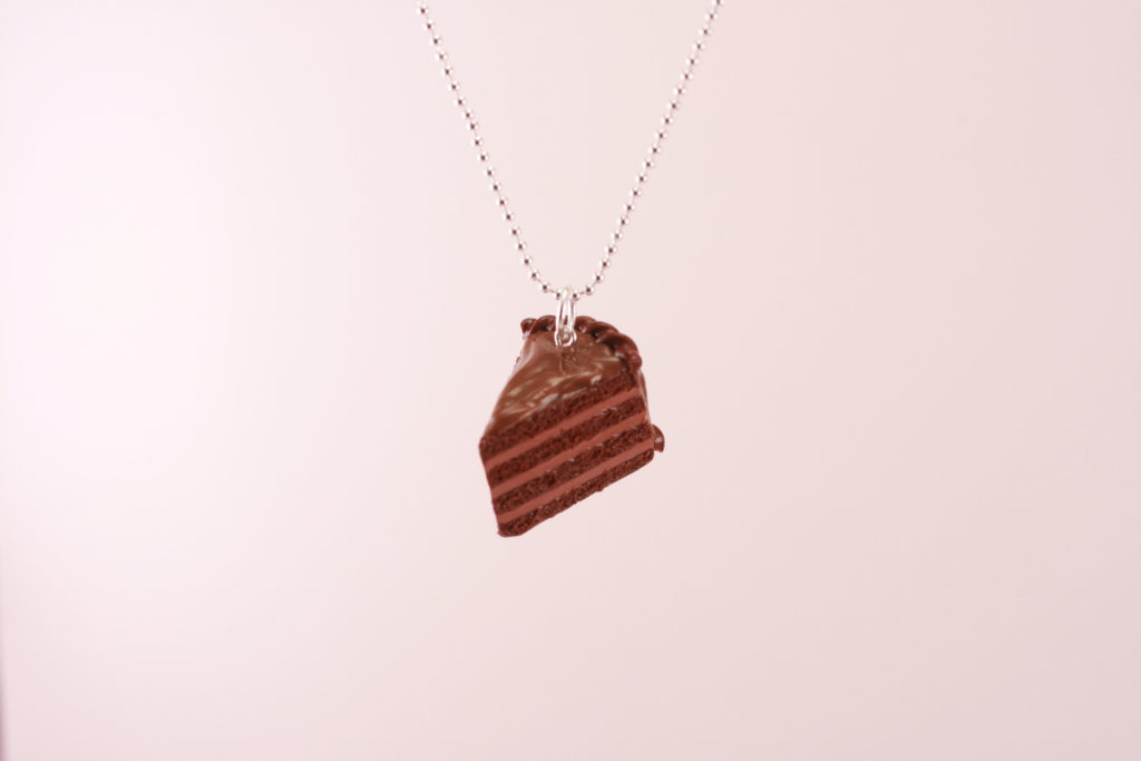
Here’s an example of a photo where my chocolate cake necklace wasn’t really in focus, especially that front part of the cake.
When you look at it, it kind of makes you feel like you need glasses.
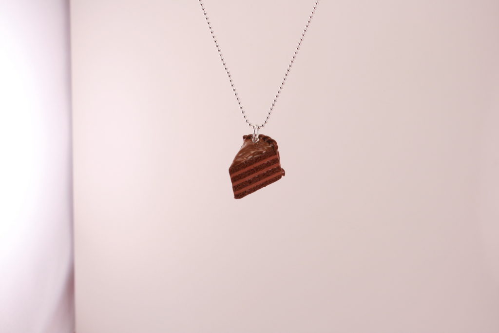
Compare that with this photo that I took just a few seconds later, where the cake is in focus, and it looks a lot clearer and sharper.
Here’s another example of a photo that’s blurry.
It can be really subtle. You can’t even really tell it’s blurry unless you zoomed in really close to the lollipop itself.
Good photos shouldn’t have any crazy distractions happening on there.
Try to avoid putting any props or extra items in the photo if it’s not a part of the product.
I think it’s fine to do this as long as you know to make the product in focus, but the rest of the photo with all the props and extra items are out of focus, like this.
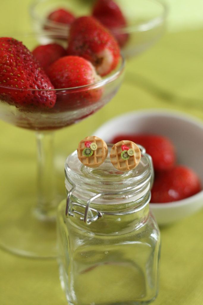
When you do it like this, you’re guiding the customer’s eyes to pay attention to whatever is in focus, which is the waffles.
Here’s an example where the props don’t help the product.
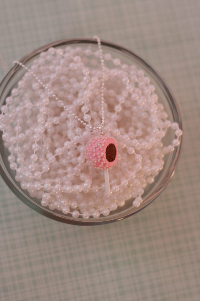
The reason you want to add props or use fun colored backgrounds in your photos is because it helps brand your photos and it gives your customers an experience.
It makes them feel something versus just a white background. I do think it is equally as important if not more important to have white background photos, but they can be kind of sterile.
Photos on a white background are great at giving your customers a clear idea of what they’re buying, but they don’t necessarily make your customers feel anything when they look at it.
Choose backgrounds that help the product, not distract or take away from it.
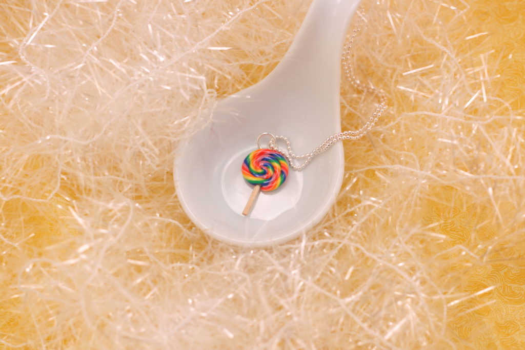
Here’s an example of my lollipop again on the yellow background.
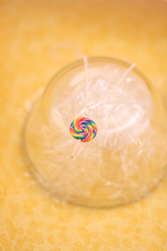
This particular background just doesn’t work for the lollipop. It doesn’t help the product stand out and shine as it should.
Instead because of the colors, you can’t really see the lollipop stick. It blends in with the yellow background.
Position Your Products Well
You also want to take the time to position your products well. If there’s a front side to your product, make it look good before you take a shot.
With a lot of my photos, because I sell necklaces, if I’m taking a flat lay photo, I need to make sure the necklace chains are straightened out and neat and there’s not like a kink in there that shouldn’t be there.
Just being a little bit organized like that can instantly make your photos look that much better.
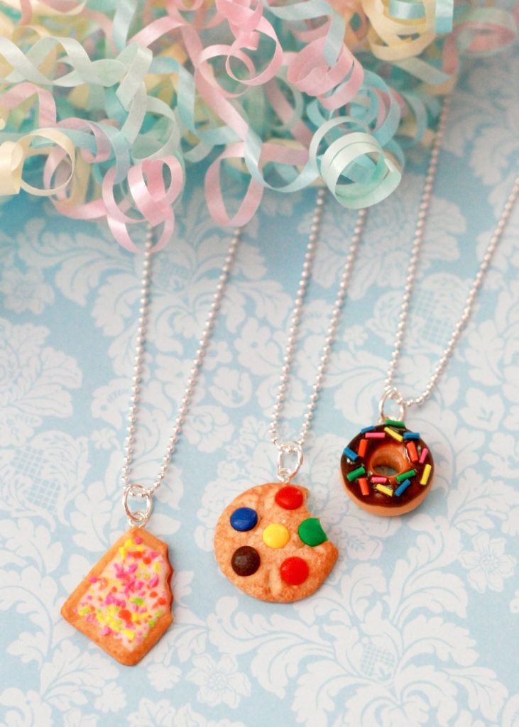
That’s not to say that necklace chains that aren’t straight can’t look good.
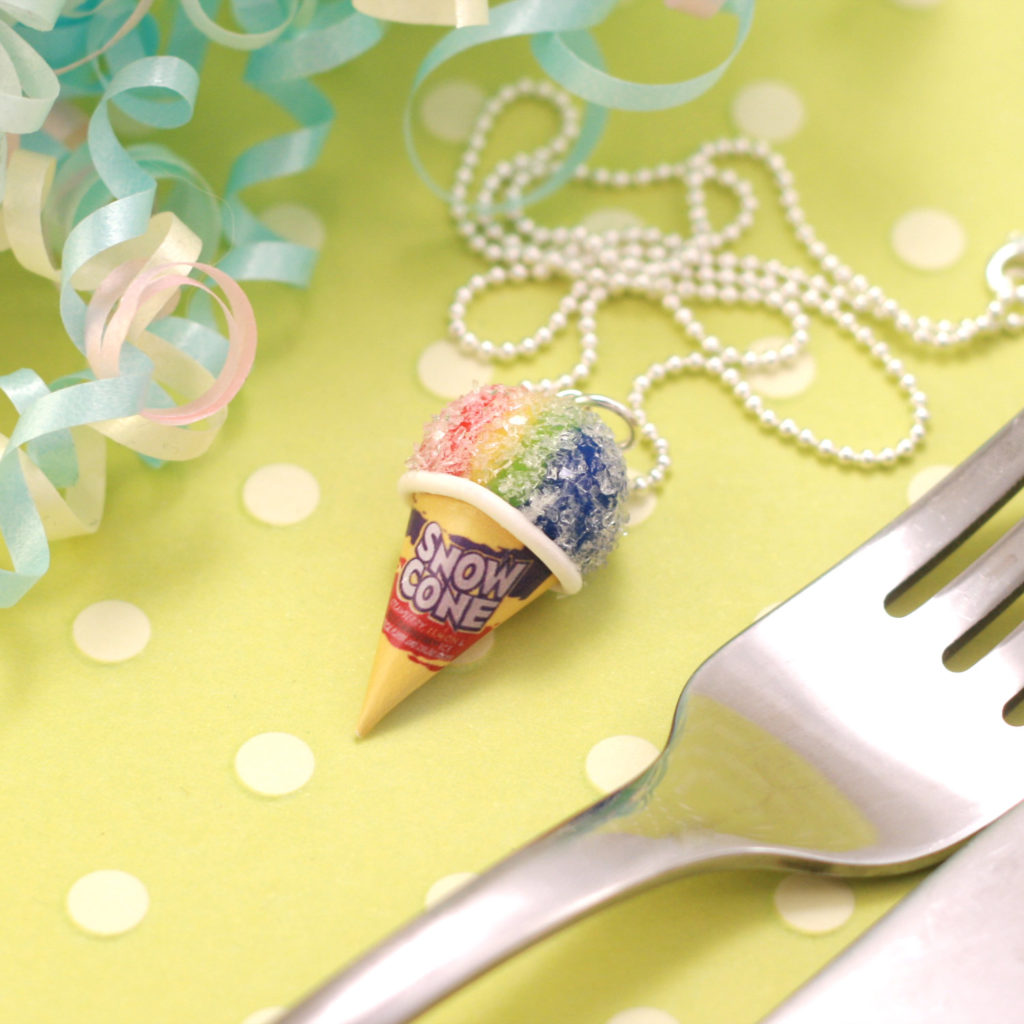
I think even messiness can look even and balanced.
It’s not a hard and fast rule that neatness is the key. It’s subjective.
Bottom line is, pay attention to the details and spend the time to arrange your products before you photograph them.
Products on Models
When it comes to product photos on models, you want to make sure your product is always on focus.
This isn’t like some high school senior photo session. Your product should be front and center, not the person that you’ve got modeling for you.
You’ll actually often see model shots where their eyes are cut off and it’s just a shot of their hand wearing your ring.
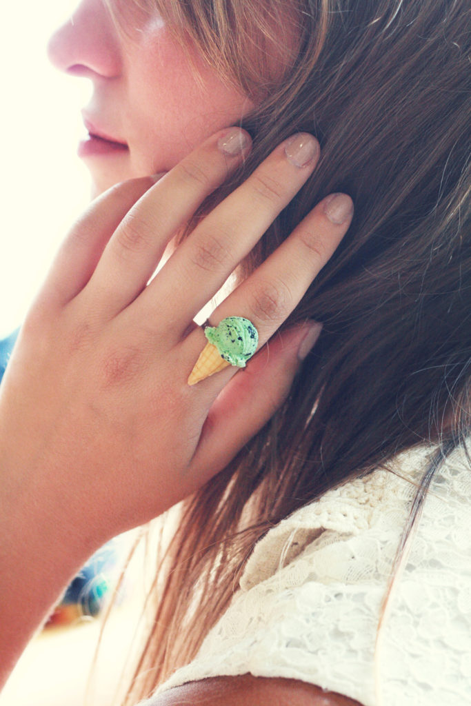
If you’re going to put together a day where you’re photographing your products on models, invest the time into planning their wardrobe and overall styling of the shoot.
Scout locations and figure out where you’re going to photograph them. Remember, the background should match your product and brand and it should help your product, not distract from it.
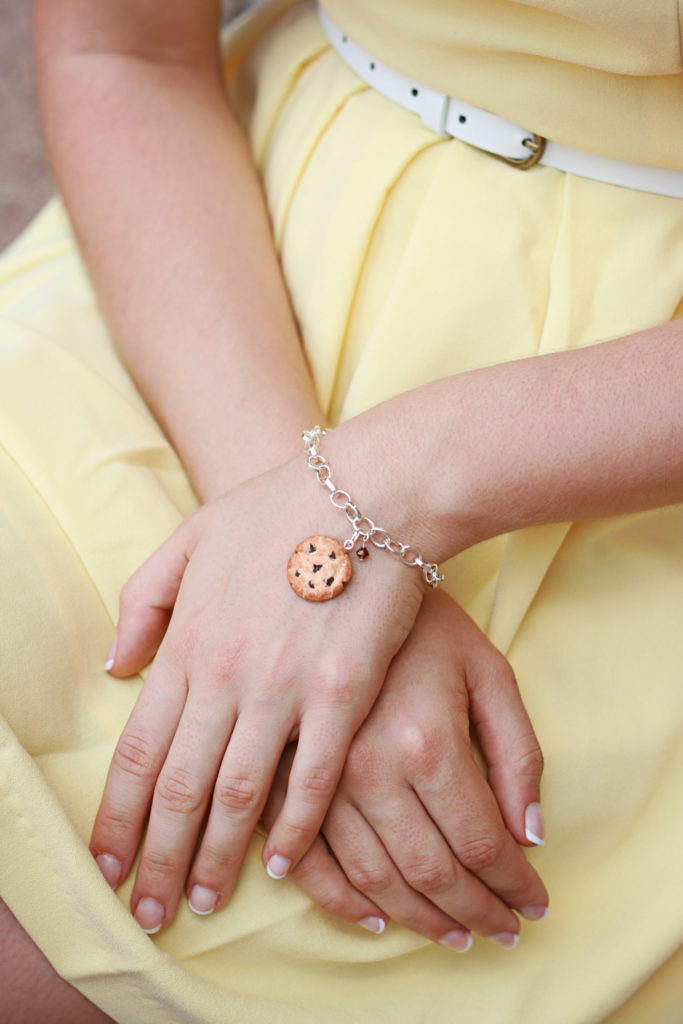
Take the time to plan out what outfits go with which products. Do some shopping around. Have a plan for how you want your model to do her makeup and hair. Choose models that match your brand.
Everything should always be aligned with your brand.
Product Shot Style
When it comes to the types of shots for your photos, I like to err on the more the better.
Remember that your photo is the only point of reference your customer has of your product.
They can’t touch and feel it in person, so make it easy for them to trust your product so they can buy it.
If you sell handbags, for example, it’s a huge mistake if you don’t take photos of what the inside of your handbags looks like.
If there’s an external pocket on the backside of your handbag, you for sure want to photograph that. Even if there’s no pocket on the outside, you generally want to photograph every single angle and nook and cranny of your product.
Show close-ups, so people can see the detail and texture that goes into making your product.
The more photos the better.
I’ve never once seen a shop where I thought there were too many photos. There is no such thing. It can only help you.

How to Get Great Product Photos
For the rest of this post, I’m going to show you how to get great product photos without it costing you a ton of money.
We’re not going to get into taking product photography on models, because that’s a whole other post for another time.
This is just for taking those photos that are on a white or colored background.
One thing I want you to know is that product photography is a two-step process.
The first step is taking the photo.
The second step is editing the photo in some sort of photo editing software, like Photoshop.
Most people make the mistake and think that the photo should appear perfect right out of the camera, but even professional photographers put their photos through some editing.
You Need a Lightbox
What you need is a lightbox. You can make your own or you can buy one for ten dollars on Amazon or eBay.
If you want to make your own, you literally just need a cardboard box, a blade or scissors, and some thin white fabric or thin white printing paper and some tape or a stapler.
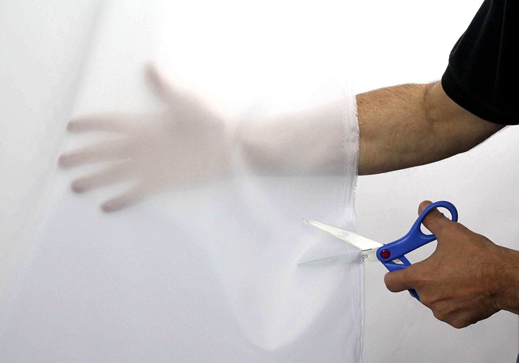
I’m sure that since you’re crafty, you have all those things.
You’re just going to cut out the left, right and top sides of the box while leaving about an inch border of cardboard around the edges.
Then tape, staple or glue on the white paper or fabric on to where you cut the cardboard out.
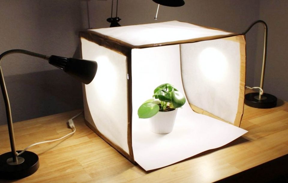
I actually think the lightboxes on Amazon or eBay are worth it because many of them come with a built-in LED light which works great for taking product shots.
Lights & Lightbulbs
But if you go this manual route of doing it yourself or getting a lightbox that doesn’t come with a light, you’re going to need to spend some money on getting some lights and light bulbs.
I recommend clamp lights cause they’re easy to position and they’re flexible and I can put them anywhere.
They’re around ten dollars each at most home improvement stores like Home Depot, Lowes, or Menards.
You’ll need three of these.
The reason you need three is so you have a light at every angle. If you use just two lights, there’s going to be some shadows at one side of your product and remember, too many shadows can be distracting.
Three is a generally what will give your products balanced lighting.
Now for the light bulbs.
Lights have color to them.
If you use a light that is colder, it casts a more blue color on your product and can mess with the colors. That also makes it difficult for you to get that true white background, if you’re going for white background photos.
You also don’t want lights that are too yellow.
My favorite are 100 watt daylight light bulbs. They have the most natural light look that you can get in a light bulb.
Using Natural Light
While we’re on the topic of lighting, some people say they like to shoot with natural sunlight.
The trouble with that is it’s a lot harder to control.
If you take a photo of your product under direct sunlight, it’s going to do the same thing as a flash. It’ll give you really harsh shadows and it just doesn’t look good.
Sunlight also varies in intensity from day to day, depending on what time you photograph.
It’s totally inconsistent.
It might be cloudy out or maybe you’re in a winter month when there are just fewer hours with natural sunlight.
One of the most important things when it comes to your product photos is consistency. That’s one way to build trust and credibility with your potential customers.
You can get that consistent look if your process for taking photos is consistent.
Natural sunlight is unreliable, but using actual lamps with a lightbox is consistent.
This is why I never take photos using the sun.
Setting Up Your Lighting
So what you’re going to do with the lighting then is put each lamp on the left, top, and right side of the product.
Make sure that you have some sort of diffuser between the light and the product.
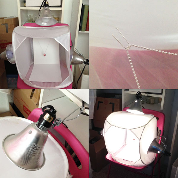
You’ll also need your background.
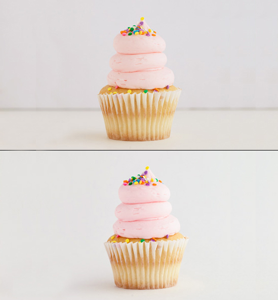
If your product is on the ground of your lightbox, when you take your photo, you’re going to see a seam. That’s the line of the corner of the box, running behind your product.
When you’re looking for your background, look for cardstock or any sort of creaseless material that’s longer than the height of your lightbox.
You want the length to overflow from the top of your box to going under your product and beyond the product. This is how you achieve that seamless background. It’s with using an extra-long sheet of paper like this.
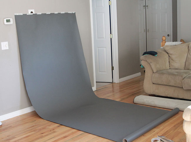
So here’s the difference between using seamless paper and without.
Photographing Large Products
If your product is larger than what can fit in most lightboxes available online, you’re basically going to replicate this lighting and diffuser system, conceptually, but on to a larger scale.
For the lights, you can find lighting kits for under a hundred dollars for two or three lights, with lightbulbs, and with the diffusers.
You really don’t need to spend a lot here.
Don’t be tempted by getting the fancy light kits that have a lot of bells and whistles. They don’t make that much of a difference for what we’re needing to do.
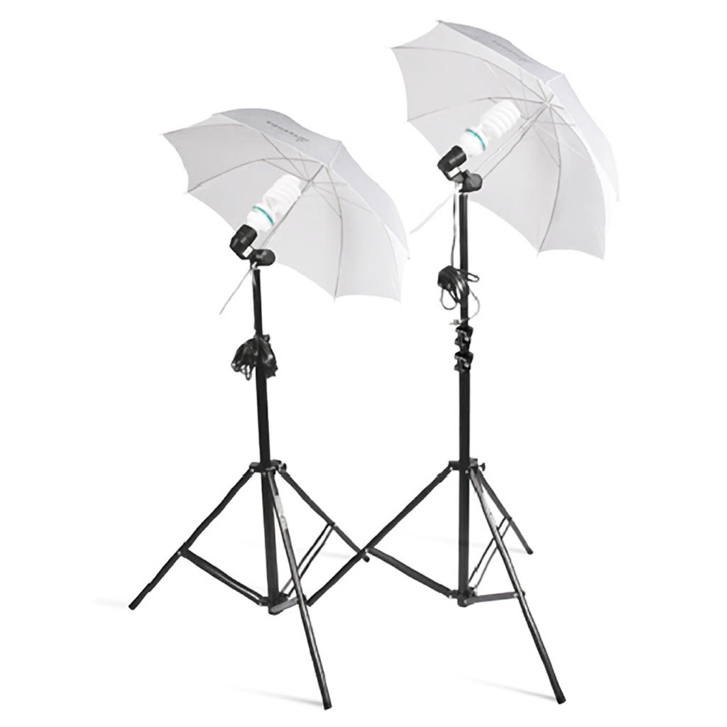
Since those lights already come with umbrellas that act as the diffuser, you don’t need a box. You just need your background, like this.
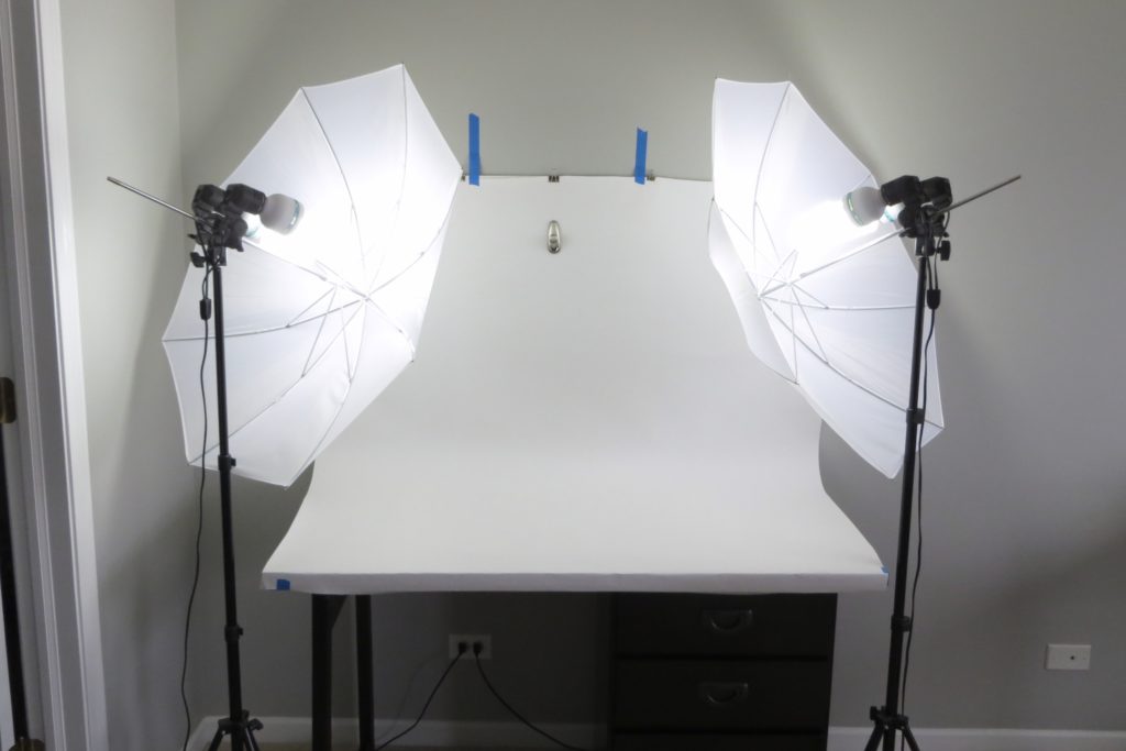
If you need to go even bigger than this, you just need a bigger background.
You can find rolls of seamless paper online if you can’t find them in your local stores.
I hope you found this post helpful. If you have any questions, drop them below!
Leave a Comment
Liked this article? Share it!
Unlock a Profitable Handmade Business
in Just 12 Weeks Without Using Etsy
or Social Media
FREE WORKSHOP
This workshop is for anyone who makes and sells a handmade or physical product, including jewelry designers, artists, paper designers, bath & body product makers and more!
What You'll Discover
The #1 mistake people make with Etsy & social media that causes shops to FLOP
The secret to making it with your handmade shop so it's no longer just a hobby
How to make sales in your handmade shop with ease so you can finally get to 6-figures
TAKE ME THERE
Leave a Reply Cancel reply
About
Blog
A Sale A Day
Student Login
Free Class
Contact
Terms
Become A Student
Watch On YouTube
Student Reviews
See My Handmade Shop!



Your email address will not be published. Required fields are marked *